Thursday, March 27, 2008
Game Changes
One of the first things I noticed was that the game moved really slowly. I was surprised at just how slowly the game pace was, even when both players understood the rules. We changed some rules in the middle to see how the game was affected. As a result, I definitely want to make some permanent changes in the game.
There were several major things we think made the game cumbersome. First of all, we found that waiting to collect 2 Mortals or 5 Venials before moving down a circle made the game drag. We changed the rules to 1 Mortal and 2 Venials for moving down a circle. This sped the game up significantly. It also made it much, MUCH easier to keep track of how many Sin Cards a player still had to discard in order to move back up a circle. This was particularly important because one of the reasons we were playing the game was for me to figure out how to handle the climbing of circles upon paying Penance cards (Glory Be, Hail Mary, & Our Father cards). Since a player has to drop a circle every time he/she receives 2 venial sins, I needed to decide whether a player should have to get rid of both venial sins to climb a level or just 1 of them. My friend and I decided that whenever the number of Venial sins dropped back to an odd number, the player could move up a level. I am still pretty stuck about how to explain that clearly on the
instructions, though.
Anyway, some other things that need to be addressed include the paying of Penance Cards, the proportions of the Penance Cards to other cards in the Redemption Card draw pile (formerly "Action Cards"), and determining the final order of play during a turn. I had an elaborate list of combinations of certain Penance Cards that had to be collected in order to "pay off" given categories of venial sins. Not only were the combinations difficult to remember (nor did I know how to present them effectively on the bottoms of the Penance Cards), but it took forever to collect enough Penances to be able to pay off even one venial sin. My friend and I changed the rule: collecting 1 of each type of Penance Card is sufficient to discard any 1 venial sin. The change made the game immediately seem better, but it also slowed the game down because players could move back up the circles more easily.
I don't think the cards were shuffled very well when we played, but nonetheless, the proportions of the Penances to the other Redemption Cards seemed a little high. Also, the proportions of the Bonfire Log cards to the other Sin Cards seemed rather low. So, I know the proportions need to be changed, but I'm not sure what they should be. I'm thinking that the only way to really find out is by trial and error (I'm sure game-makers probably do alot of tests, statistics, etc), and there isn't much time for that, unfortunately. I think they can certainly be tweeked to be better than they are currently, though.
Play order of the turn is difficult as well. I like the idea that a player can (and must) spend Penances at the beginning of his/her turn. This makes it so that the player has the opportunity to reduce the number of sins accumulated before being required to draw another Sin Card. This might keep someone in the game (and in suspense) for at least one more turn. I like that the player must next draw a Sin Card, before having the opportunity to draw or play Redemption Cards. Somehow, this seems to match the "You just can't get away from sin!" and "Sin will always find you!" and "You're a sinner first, before all else" doctrines. PLUS, it keeps the players in a little bit of suspense about whether their next Redemption Card draw might allow him/her to climb further from the Abyss (in case other players try to finish him/her off) or knock someone else out of the game. A little twisted, I admit, but it seems fitting. :) The two problems with it are: 1) It's really hard to remember to draw the Sin Card and satisfy it before drawing/playing a Redemption Card 2) Since a player has the option of not playing a Redemption Card during his/her turn, it's hard for the subsequent player to know when the previous player's turn has ended. I guess they'll just have to ask.
During the course of the game, I also realized that the Mercy Redemption Card is useless. It states, "Draw an additional Redemption Card." This is silly because the result is the same as never having drawn the Mercy Card. So, I changed it to "Draw 2 additional Redemption Cards." I also added a new Redemption Card or two...there was a Bubonic Plague Card, among others. I also changed the Intercession Card to be a card that doesn't necessarily help other players (as is, it's a card that you give to another player that allows that player to discard some Sin Cards); it's now more self-serving.
We're still working on formatting the cards. We need to do the icons for the following cards: Bonfire Log, Glory Be, Hail Mary, and Our Father. We also want to move the titles of these cards to the bottoms of the cards so that the symbols would be dominant and the titles wouldn't be in the same places as the sin titles (they have different actions associated with them, so I don't want the confusion).
Some additional ideas my friend suggested were:
-Allowing the bartering of Penances, Sin Cards, etc. between players
-Dropping two circles for drawing any one of the Seven Deadly Sins
-Not drawing Redemption Cards unless you drop a circle during the turn
-Offer a variety of "Collect a Bonfire Log" Cards in the Sin Card draw pile - the number of Bonfire Logs to be collected might be 1, 2, 3, or perhaps even equal to the number of mortal sins in front of the player. We decided this is a good idea after neither of us collected more than 4 Bonfire Logs throughout the entire game (and we kept giving them back, too).
-Require that a Redemption Card be played/dicarded every turn. Don't like that, though, becuase then you can't easily collect Penance Cards.
So far, I'm most interested in his Bonfire Log suggestion. I didn't really have a chance to test the other suggested rules to see how they would affect the game.
Monday, March 24, 2008
Reactions to Game Play
With our game, some of the specific feedback was expected, while some of it was rather surprising to me. Overall, I was disappointed to the reaction to it. I fully understand that our instructions were sub-par and, therefore, were the root of most of the confusion. This is particularly true considering that even I couldn't tell the difference between some of the majuscule and minuscule typeface (mortal & venial) on our sample Sin Cards. That said, I don't really think the game is that hard to understand. I was pretty surprised that some of the other students had so much trouble with even the over-arching concept.
This is perhaps the first time that I've really felt the effects of being 10 years older than my classmates. My thought was, "I'm not Catholic either, but I have a clue about the religion. How can they not have any exposure to some of this stuff? Haven't they seen any movies with Catholic characters or studied any European history?" After all, Catholicism has been a major social and political force for centuries and is currently has over 1.1 billion adherents in the world (that's almost 1/6 of the entire world's population)! (http://www.catholicnewsagency.com/new.php?n=8620)
Furthermore,
"Roman Catholicism in the United States has grown dramatically over the country's history, from being a tiny minority faith during the time of the Thirteen Colonies to being the country's largest profession of faith today. With 76.9 million residents professing the faith in 2003, the United States has the the third largest Catholic population in the world after Brazil and Mexico. Approximately 44% of American Christians are Catholic; it is four times the size of the next largest faith profession, the Southern Baptist Convention Denomination."
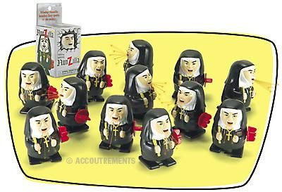
Therefore, to clear up some of the confusion, Luis and I have decided to re-frame the game, as opposed to significantly modifying it. It was suggested that the game could be educational in some manner, as well as to not promote stereotypes, but that would be contrary to the entire point of the game. We may consider giving a small amount of background to the religion (for those with absolutely no familiarity with the faith) at the beginning of the instructions, but otherwise, the game will be re-framed as "A Guilty Game for Recovering Catholics" (or something along those lines). The intended market for this game is that segment of Catholics who can see humor in their religion. The game would be sold in novelty shops, perhaps next to the wind-up nun who spits fire and waves a ruler ("Nunzilla"):
 Nunchuck:
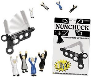
and products like these, available from http://www.landoverbaptist.com/:

For a little background & explanation of some of our choices:
Regarding Sins - Mortal vs. Venial
-Mortals are the big ones (pre-meditated badness). We researched lists of them and tried to make them specific to a situation to add in some humor.
-Venial sins are basically accidental sins. Therefore, we decided to have things like "picking your nose on a Sunday" because they are 1) not premeditated and 1) rather silly things to feel sinful for doing it in the first place. We felt we had some leeway in creating our venial sins because of their open-ended nature.
There are several elements in the game are clearly satirical to a reasonably aware audience:
The 'nine levels of hell' immediately set up the game as a satire. The nine levels of hell are not even part of the Catholic doctrine (in which hell is just hell). They are a reference to Dante's Inferno, which he wrote as a joke (really - he wrote his own friends into the levels of hell, complete with inside jokes, etc).
-The element in the game in which a player builds his/her own bonfire on which to be burned at the stake is a reference to the The Inquisition (and all the other silly things that have been done in the name of religion), Joan of Arc, and witch-burning. Since catholicism was the (forced) religion of Europe for centuries, it follows that Catholicism is a fitting victim of satire.
-Through the methods of negating sins, the game also satirizes corruption in the church (or any large, dogma-based organization, for that matter) in that church power and redemption were historically often linked with wealth (purchasing indulgences) and "buying" forgiveness through confessions and penances.
-The idea that there aren't rewards built into the game that allow a player to get to heaven reflects the very guilt-laden and oppressive nature of the certain religious faiths. Our game is meant to make fun of the controlling, top-down, sheep-mentality-affirming nature of many large faith-based organizations. Because the game's outcome depends partly on which sins you randomly draw (in other words, what someone else defines as your sin), the game also touches on the doctrine of pre-destination (found in some Protestant faiths), as well as the idea of constant, insurmountable unworthiness.
-Albeit temporary, part of the humor of this this game is it's presentation around Easter time, originally a pagan holiday. The Catholic church superimposed the celebration of the Resurrection of Christ onto the Spring Equinox because their attempts to wipe out the pagan holiday failed.
So, again, next thing for us to do is re-center the user so that the experience is appropriate. This will involve putting a bit of background into the instructions, making the instructions explicitly clear, and changing the game's title to make the satire instandly recognizable as such.
Suggestions from the class that I found helpful:
-explaining the differences between mortal and venial sins and making them more obvious through our typeface
-giving a bit of background on the Catholic faith, for those who aren't at all familiar with it
-using a stair-stepping design for the gameboard (we already intended to do this, but it's awesome that other people thought doing this would add to the game)
-using ironic characters like nuns and prisoners for gamepieces. Great idea! I think it would also be fun to add, perhaps, a little girl in pigtails, a baby in christening garb, and a Tibetan monk
-Removing / changing the "Free Will" component of the game - having cards that the player must play immediately upon drawing them mixed in with cards that the player may keep and play strategically at other times was very confusing
Overall, I'm happy with the game concept and feel, so far, that it fulfills the assignment of "creating a game" (even if some students in this particular class did not catch all the subtleties).
More to do!
Modular Typeface Redo, In Progress
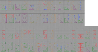
The page we worked on to get the final modules is shown below. My initial ideation is on the right half of the page. Amber worked on the left half, showing me how to make my modules behave similarly to what I had, but also work within the grid constructs (since, before, I'd just sorta broken the forms wherever I felt like it).

This is a screenshot of the 3 basic forms we ended up with in InDesign (along with some mirror images of them):

Below, you'll see my attempt to build the typface using only these 3 modules. It is going better than my first modular version did, but I'm struggling with maintaining consistent x-heights, cap-heights, and getting D to not look like G. Although certain grouping of letters look like they match {m,n,r,u,v,w}, {b,d,g,h,p,q,y}, {A,B,E,F,P,R}, {U,V,W...}, the groups don't really match one another. The shapes used for minuscule bowl letters don't translate very well into {m,n,r,u,v,w} and they all look funny together because they're different heights. I have a similar problem with stems on majuscule and ascenders/descenders on minuscule letters - two stacked yellow shapes make a nice, straightish form, but they are one pixel shorter than all the letters using the red+yellow stem/ascenders/descenders in {b,d,g,h,p,q,y} & {A,B,E,F,P,R}.
I really like the overall look on the typeface - it's almost techno-calligraphic or something. Not sure exactly how I would describe it. I think I might see things differently if the modules were all the same color, but I actually enjoy the playfulness of the colored modules moving across the page. It's almost like the red modules are doing cartwheels. Or all the modules are involved in some bad 80s strobe-light dance... :)

More to do!
Friday, March 21, 2008
Reactions to Rules of Play Article
We have lots of ideas, but are having trouble funneling down into just one. Part of the difficulty is that we see value in many different types of games and keep bouncing around between concepts we like. Also, we seem to have grown up playing very different games from one another, so communicating about them is sometimes a bit challenging for both of us.
Game elements that Luis and I currently want to include:
-ability for any # of players to participate (and potentially join in at any time)-a mix between skill and chance
-some element of mystery regarding the upcoming plays of other participants
-relative simplicity => relatively short game length (20 min)
-fast moving / short turns (short reinforcement schedules)
Regarding Rules of Play.
Wow. Salen and Zimmerman's treatise is certainly well-researched and exhaustive. Honestly, I also found it to be exhausting, tedious, and unnecessarily redundant. That said, I think I did gain useful information from the writing, although I'm not entirely sure how to apply much of it to the creation process. The issue, it seems, is how one integrates all this information into the game design process. The writing did a good job of dissecting and defining what consistutes play and game, but is not that helpful in helping a newbie actually create a meaningful game. In other words, it's a nice, theoretical, academic dissertation, but not a very useful instruction manual.
What I gleaned from the reading, though, is as follows:
-Definitions of "play" and "game" vary widely, depending on linguistics and cultural context. Even experts in the fields don't seem to agree on what constitutes a game. I find the authors' definition of game to be pretty reasonble.
-In order for a game to be played at all, it must be enjoyable. It also must attract the players in the first place and encourage them to play until the game ends. For this to happen, the game must be meaningful, on at least one level, for all the players involved.
-As a game designer, one creates the system through which it is expected that the players will interact. The designer, however, does not control the actual experience of the players. The more a designer can understand the perspectives of the players, the more likely he/she is to create a meaningful, and therefore desirable, game.
-Games need to have at least some measure of feedback for the players or else the game seems pointless. However, the game also needs to allow leeway within the actions of the players; otherwise, the game is boring and also pointless.
-Formal games (such as the one we're trying to create). Generally have a beginning (initial setup in which all players are equally able to win), a middle (the actual play / carrying out of actions), and an end (a goal that, once met, terminates the game)
-Games are contextual (culturally/extrinsically, and within themselves/intrinsically). Since we're likely to be designing for our own culture, this is just more of an obvious observation.
So, basically, we need to create the system in which the game operates. And to do that, we need to come up with rules that allow player choices to influence the outcome of the game, but within certain constructs. The constructs should have reasonably simple rules, with the overall game being of medium complexity (to avoid frustration or boredom). The game must have a perscribed goal and multiple ways of achieving it (through the varied actions of players) through the concept of "imperfect information." This allows for some mystery and strategy, and therefore, interest. We need to think carefully about the structures of our "action-outcomes,">
So, how do we actually do this?
I think the article made me think about the "macro" version on the game, which may help. In other words, what do we want the overall theme to be? How does the game look at the end? Perhaps working backward will get us unstuck...
A decision tree, as suggested in the writing, may help us with our overall concepts & may be a good place for us to start trying to diagram the game.
By the way, from now on, I intend to refer to pigs as "squerdlishes." It's just way, WAY more fun to say than "pig." :)
Monday, March 17, 2008
Modular Typeface, Version 1
Anyway, after chasing my own brain around in circles and trying to come up with something "interesting" and thematic (I dropped those concepts because I couldn't figure out how to make them modular), I tried looking at more modular typefaces online. I saw a typface that used a layout of different shapes and highlighted only certainly segments at a time in order to make the characters (like digital clock numbers). I decided to use that concept and starting drawing in Rhino in hopes of coming up with some shapes that would allow me to piece together all the letters. This is how I started:
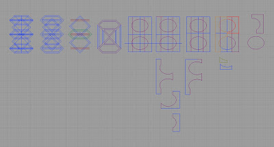
I picked out shapes I thought might work and then broke them down into these parts for building the typeface:
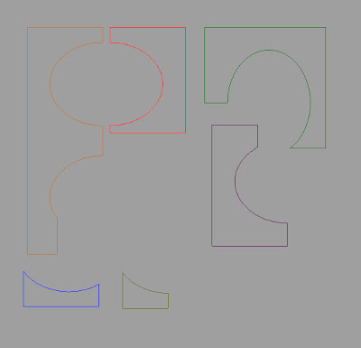
This is the modular typeface I came up with. I left the colors varied so that the viewer can see which parts are which (I know you can't see the yellow very well, though). I can't say that I love the typeface overall, but I do like parts of it, including the idea of breaking a regular shape into irregular pieces and building a typeface from there.
Pixel-Based Typeface Aphabet

