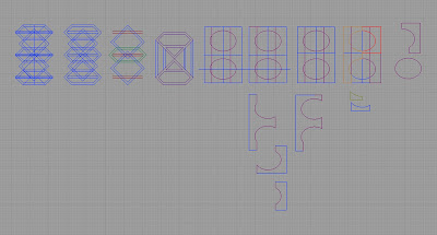
Anyway, after chasing my own brain around in circles and trying to come up with something "interesting" and thematic (I dropped those concepts because I couldn't figure out how to make them modular), I tried looking at more modular typefaces online. I saw a typface that used a layout of different shapes and highlighted only certainly segments at a time in order to make the characters (like digital clock numbers). I decided to use that concept and starting drawing in Rhino in hopes of coming up with some shapes that would allow me to piece together all the letters. This is how I started:
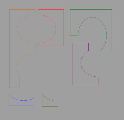
I picked out shapes I thought might work and then broke them down into these parts for building the typeface:
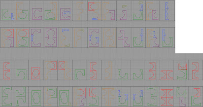
This is the modular typeface I came up with. I left the colors varied so that the viewer can see which parts are which (I know you can't see the yellow very well, though). I can't say that I love the typeface overall, but I do like parts of it, including the idea of breaking a regular shape into irregular pieces and building a typeface from there.
No comments:
Post a Comment